Creative Topics
Explore Our Blog: Art, Design, Business, and Beyond!
How To Unlock The Power Of Color AKA Branding
- Social Media
Do you walk around the supermarket and notice a remarkable color, then immediately think of a brand? Maybe you are driving down the road and see the color yellow, one distinctive color.
You know what we’re talking about, McDonald's.
The primary colors of McDonald's are based on science. Red is energizing, raising the heart rate and, consequently, appetite. Yellow is the most obvious color to spot from a distance and is associated with happiness. Building on our previous blog post , a major aspect of building your own brand is having distinctive characteristics.
Fonts
That might be new information to you, but did you know that different brands can share a font and you can’t even tell?
Look at this.
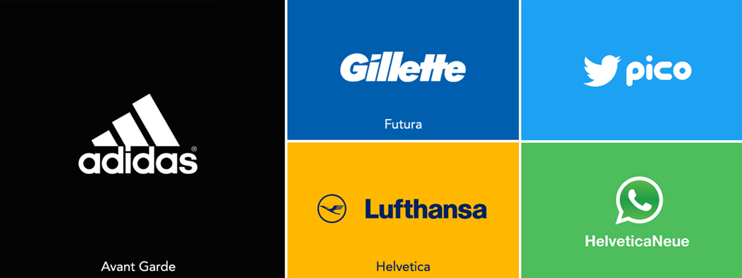
That is exactly the same font! You couldn’t tell because of the distinctive colors. So, while having a distinctive bespoke font may be beneficial to your business, it will rarely draw enough attention to get you what you want:
Top of Mind Awareness!
To build a memorable, iconic brand, you need to have very distinctive visual elements. We mentioned that last week. Fonts are one option, but they aren't distinctive enough to convey your brand's personality.
Shape
Shapes are a huge aspect of branding, but unless you have a really distinctive shape, much like Nike’s check or again, McDonald’s arches, you’re not in luck to stay memorable.
Look at this.
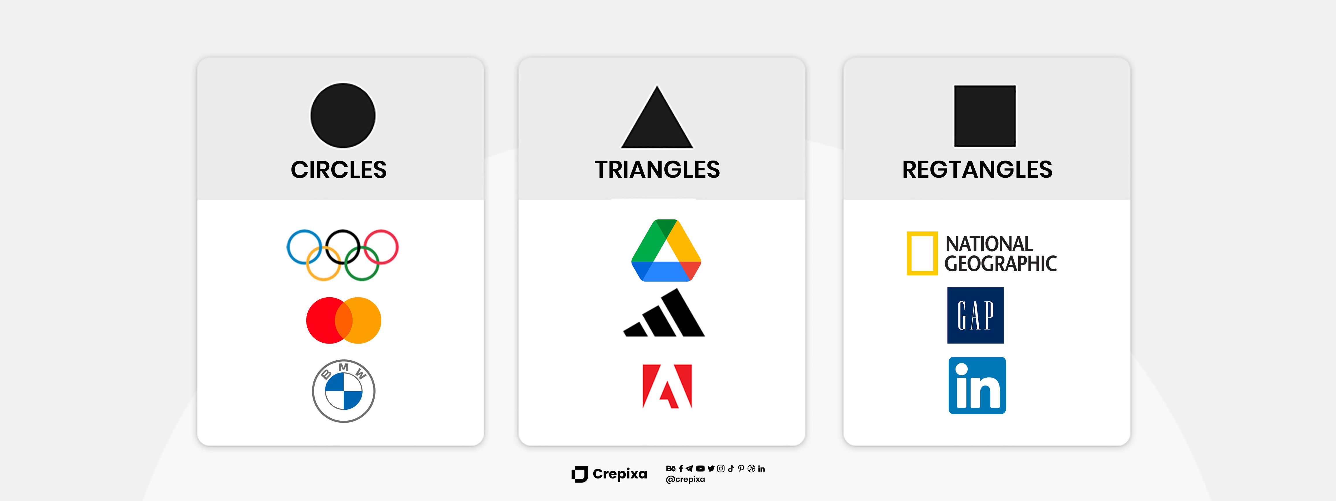
Circles: Using a circle over the first half of the lettering, the Showtime logo emphasizes the first portion of the design. To draw attention to a particular area of your design, you can use circles as highlights. If you want to create a wholesome, interconnected feeling in your design, you can also incorporate circular imagery into your typeface, as Google does, or you can use a circle as your entire icon, as Headspace does, to give your audience a general sense of calm.
Rectangles: the most trustworthy shape, can be incorporated throughout your logo design, as T-Mobile does, to demonstrate dependability from start to finish. You could also take a cue from Uniqlo and frame your entire logo within a square to convey to your audience that the products you sell are of a high caliber.
Triangles: triangles can represent a variety of ideas depending on which way they're facing. As Kenwood does in their logo, think about adding a triangle as an accent to one of the letters. If you want to give your design an edgy appearance without committing to the entire design, you can also use triangle-inspired lettering like Metallica does in their logo.
Squares, triangles, or circles can make up a huge part of your branding, but will anyone ever remember your brand for being a square or a circle?
Color
Although 92 percent of consumers agree that visual appeal is the most persuasive marketing element overall, up to 85 percent of consumers say color is the most influential factor when selecting a specific product. We all know that green is associated with nature and that red is associated with danger, but both colors also have other associations and meanings.
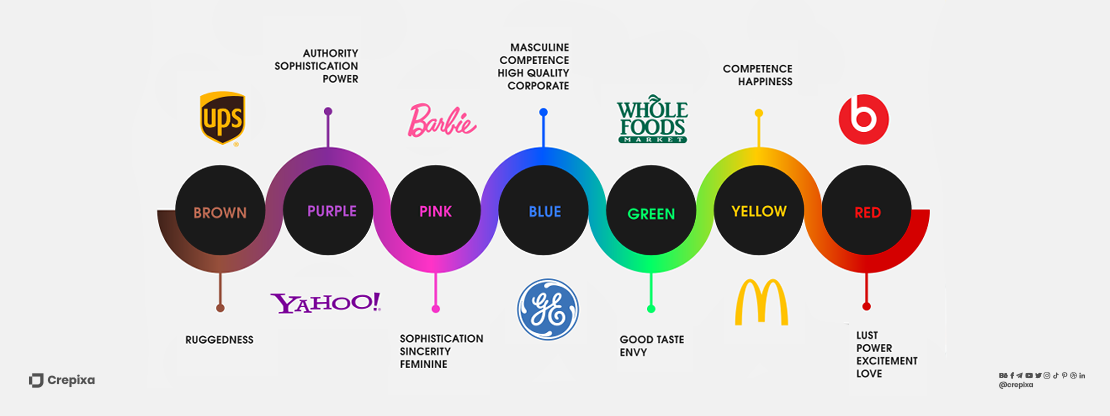
The study of how colors influence perceptions and actions is known as color psychology. It enables us to comprehend color and take advantage of it, particularly when it comes to branding and marketing. It's critical to choose the right color scheme for your brand because, according to a study, between 62 and 90 percent of a product's evaluation is based solely on color. Decide what your brand stands for, as having a clear understanding of your objectives and the emotions you want to evoke in your audience will help you choose the ideal colors for your brand. Consider your brand in the ways listed below:
Do you want your clients to be rich, happy, or educated?
Do you want your target audience to feel upbeat, self-assured, or smart?
Characteristics: Is your brand serious, inspirational, or both?
You can further refine your color scheme by considering how you want your brand to be perceived by customers.
Therefore, even though your product may be natural, which is typically associated with the color brown, your brand essence may be about celebrating goodness, in which case you might choose optimistic yellow.
In the world of colors and branding, the options are limitless.
Crepixa knows it better, let’s talk!


